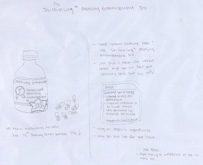
my theme for this assignemnt id dental caries, aka tooth decay.. i want to show the process of tooth decay in this infographic.. i used the row of teeth as a timeline, showing from the whitest tooth to a decay to a filling..
the picture is made using 3 pictures.. the mouth, the tongue, and the lollipop.. this one is the copy i presented in class.. this is the first time i use photoshop in my assignment so i wasnt v familiar with it.. so took quite some time..
after comments from classmates, decided to add in numberings..
also decided to add in more infomation, since this is a infographic... to inform ppl..
i make this postcard by using the various landmarks that can be found in asia. traced it out from the pictures found online.. i aranged it in a heart shape because i wanted it to represent the warm hearts in asia.. esp now when we can see in times of crises, there are actually many helpful n loving souls.. so i wanted it to show the 爱心 in asia.
this is my final product.. i like the one in warm colours because it fitted my theme..
my idea for this assignment is to make the poster to be like a movie poster.. iN2015 is about the individual owning the world, everything at their convenience.. so i wanted to do it with only a weblink there as the main source of information.. so when ppl go online to check out what exactly in2015 is, they will be experiencing the age of iN2015 for themselves..
the main characters for this 'movie' is the ppl viewing this poster.. so i put YOU at the top, similar to the character listings in a movie poster..
i wanted to do this story because recently on stomp there were many posts about ppl sitting on the reserved seats and how they do not stand up for needy ppl.. so the stosy here is about an old lady on the train on 3 diff occasions.. the first and second occasions are showing the same thing, and that is someone is sitting at the reserved seat and the old lady asked them to get up and they did so.. but on the last occasion, when the old lady again ask another person to get up from the reserved seat, the person turned out to be a senior citizen too.. the last part of the story is the twist..
the main difficulty i had when doing this assignment was that i cannot get my friends to get together to take the pictures.. i took these photos after the tutorial when i met up with my friends for a birthday celebration. i did thought about using non-human objects for this assignment, but i couldn't come up with a good story..
Because of the many many stairs in NUS, i always find walking around school is very tedious, especially when in
heels. I'm sure I'm not the only one, that's why
the lifts are always full. So i design this sign to be put near the lifts to indicate that the lifts are for females in heels. Of coz this doesnt mean that people not in heels are not allowed to use the lift. But hopefully when those people without heels see this sign by the lift they will not take the lift, and the lifts will be much more spacious!!
comments:
the second abstraction is more complicated than the first. abstraction overall is ok.
will the sign filfull it's purpose? as in will people really let female wearing heels have the priority to take the lift.
should have a comparison to show that the rest
of the people must climb the stairs.
just looking at the sign cannot tell the purpose of it.
alfred says must do something unique so work will stand out.
not a norm, a place in nus which do not have a sign. eg somputer centre, robotics lab, helpdesk etc.......
I have one more idea for this...
haha got this idea because i myself always see girls in nus showing their underwear when climbing the stairs.. when they climb the stairs they do not hold on to their skirts or show some concern over the fact that they are openly displaying their underwears.. well for those girls with good figure long legs nice butt then fine. but for those girls with fat thighs with cellulite showing plssssssssss...
this sign could be placed at the bottom of the stairs.. to inform people that this is the place to look at these girls.. well of coz it will also serve as some kind of warning for the girls to protect themselves.
for this i have difficulty in drawing, in abstracting, and in simplifying.. well that's basically everything.. i have no idea how to draw the figure to look like a girl and look like it's showing her underwear.. and the last sign has no coherrence with the rest.. and it is pretty obvious that i didnt do much abstracting.. every degree of abstraction i just minused away a few lines.. this is kind of irritating!!
didn't show this in class coz dont think there's enough time.
but in the end i decided to use the lift sign because it's more complete and easier eto understand.. changed the sequence of the abstraction.. tried doing a colour scheme..
it is not supposed to be like this... i tried using blue pink n yellow.. and for my final prototype, i chose the pink one since the sign is designed for ladies..
These are my thumbnail sketches. I tried using ice cream, co
smetics, my laptop, and skyscrappers to form my name..
In the end I decided to use the skyscrappers idea.
Comments I received from my classmates:
separate the "I" from the "L" so it dont look like a "U".
change the "G" to something
else.
"G" could be esplanade with people queueing out.
in the end i decided to use the esplanade idea because i don really know what else to do to that rounded building.. esplanade with ppl queueing up to
enter for some conceret.. i put a signboard just beside the doors of esplanade.. wanted to type some words on it but realised it's too small and the txt cant really fit in..
changed the background to blue gradient to represent the skies..
tried adding some clouds at the top of taipei 101 to show how tall it is.. but it didnt turn out well.. asked friends they said no clouds nicer.. haha someone said it looks like a typhoon is on is way.. hmmm maybe my photoshop skills aint tt good..